
Often
when publishing houses get creative with book covers it usually results
in something absolutely ridiculous, so you must imagine my surprise
when I am forced to say please stick to the anime and move away from the
forced shot.
Okay just look at this cover.
 It’s dreary and bland with nothing at all to inspire you to turn the book over to read the synopsis, let alone but the book.
And then there’s this:

Yeah, I know, half naked woman on the cover but there is something compelling about this image. It makes you want to find out what’s being those big mysterious eyes. There are interesting creatures in the background and it is clear from the cover that something otherwordly going on, which is key if you are specifically looking for a book about urban fantasy.
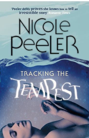
Clearly the second cover is the winner yet book two, Tracking the Tempest got the same treatment.

Jane True is anything but a passive protagonist but you wouldn’t know that from looking at this cover. Lying there in the water she looks like a little passive princess waiting for prince charming to come along and awaken her with a kiss. This cover is so out of out of character that I don’t even recognize Jane True.

Again, not only is the cartoon a better cover but it is far more in tune with the character that it is representing. It is whimsical without implying impending victimhood.

Well at least this time, Jane True is waiting to be saved, but she is still nowhere near the active protagonist that she actually is. Her eyes are downcast and just from looking at this book cover, it gives the impression that it’s another drippy romance novel. All she needs is some copious man titty beside her to fill out the look.
Compare that cover with this:

Do they even remotely look the same? The fact that there is a man driving the bike clearly sends the message that there is a story about a relationship but we don’t get to see his face, only that of the protagonist suggesting that she is the hero of her own story rather than her lover. This is yet another anime cover wherein the image is clearly active.
 Okay,
this cover is just plain and simple ugly. And what in heaven’s name is
the blue stuff at the bottom of the book because it most certainly not
water?
Okay,
this cover is just plain and simple ugly. And what in heaven’s name is
the blue stuff at the bottom of the book because it most certainly not
water?

Who wouldn’t want to hang out with these girls? It looks to me like they’re having a great time.
Look everyone, this is how they portray rage:
 I get that red is supposed to symbolise rage but what the hell is up with the sheet floating above her head?
Now contrast that to this:
 Here
is a woman clearly read to kick ass, and you can tell this by the umm
yeah, weapon in her hand. Once again, the cartoon version is full of
action and you can tell that something is going to go down.
Here
is a woman clearly read to kick ass, and you can tell this by the umm
yeah, weapon in her hand. Once again, the cartoon version is full of
action and you can tell that something is going to go down.
I think that this series shows us that once you have a good thing, that there is no need to mess with it. The cartoon covers are interesting and involved whereas the live shots are boring passive and screams please come save me. The live covers are a dime a dozen and why they thought they even remotely portrayed the awesome Jane True series is certainly beyond me.
Okay just look at this cover.

And then there’s this:

Yeah, I know, half naked woman on the cover but there is something compelling about this image. It makes you want to find out what’s being those big mysterious eyes. There are interesting creatures in the background and it is clear from the cover that something otherwordly going on, which is key if you are specifically looking for a book about urban fantasy.
Clearly the second cover is the winner yet book two, Tracking the Tempest got the same treatment.

Jane True is anything but a passive protagonist but you wouldn’t know that from looking at this cover. Lying there in the water she looks like a little passive princess waiting for prince charming to come along and awaken her with a kiss. This cover is so out of out of character that I don’t even recognize Jane True.

Again, not only is the cartoon a better cover but it is far more in tune with the character that it is representing. It is whimsical without implying impending victimhood.

Well at least this time, Jane True is waiting to be saved, but she is still nowhere near the active protagonist that she actually is. Her eyes are downcast and just from looking at this book cover, it gives the impression that it’s another drippy romance novel. All she needs is some copious man titty beside her to fill out the look.
Compare that cover with this:

Do they even remotely look the same? The fact that there is a man driving the bike clearly sends the message that there is a story about a relationship but we don’t get to see his face, only that of the protagonist suggesting that she is the hero of her own story rather than her lover. This is yet another anime cover wherein the image is clearly active.


Who wouldn’t want to hang out with these girls? It looks to me like they’re having a great time.
Look everyone, this is how they portray rage:

Now contrast that to this:

I think that this series shows us that once you have a good thing, that there is no need to mess with it. The cartoon covers are interesting and involved whereas the live shots are boring passive and screams please come save me. The live covers are a dime a dozen and why they thought they even remotely portrayed the awesome Jane True series is certainly beyond me.